Category: Web Design

Your website might be costing you customers without you even knowing it. Small design mistakes that seem insignificant can create frustration, erode trust, and send visitors straight to your competitors. The worst part? You may never know why they left.
At Extatic Design, we've audited hundreds of websites and seen the same mistakes repeated over and over. Let's examine the most common web design errors that drive customers away and how you can fix them.
This is perhaps the most damaging mistake a website can make. According to Google, 53% of mobile visitors abandon sites that take longer than three seconds to load. Every additional second of load time increases bounce rates and decreases conversions.
The Fix: Optimize images, enable browser caching, minimize code, and invest in quality hosting. Regularly test your site speed using tools like Google PageSpeed Insights and address any issues promptly.
With over half of web traffic coming from mobile devices, a website that doesn't work well on phones is a website that's failing most of its visitors. Tiny text, buttons too small to tap, and layouts that don't adapt to smaller screens create frustrating experiences.
The Fix: Design mobile-first, ensuring your site looks and functions perfectly on small screens before scaling up to desktop. Test on actual devices, not just browser simulations. Make buttons large enough to tap and text readable without zooming.
If visitors can't find what they're looking for quickly, they leave. Overly complex menus, unclear labels, and buried important pages create frustration and lost opportunities.
The Fix: Keep your main navigation simple with seven items or fewer. Use clear, descriptive labels that tell visitors exactly what they'll find. Ensure important pages are accessible within two clicks from anywhere on your site. Include a search function for larger sites.
When everything screams for attention, nothing gets noticed. Websites crammed with text, images, buttons, and competing elements overwhelm visitors and make it impossible to focus on what matters.
The Fix: Embrace whitespace. Give elements room to breathe. Establish clear visual hierarchy so visitors know where to look. Remove anything that doesn't directly serve your goals. Less is almost always more in web design.
If you don't clearly tell visitors what you want them to do, they won't do it. Websites without prominent calls to action leave visitors unsure of next steps, resulting in missed conversions.
The Fix: Include clear, compelling calls to action on every page. Use contrasting colors to make buttons stand out. Write action-oriented text that tells visitors exactly what happens when they click. Place CTAs where visitors can't miss them.
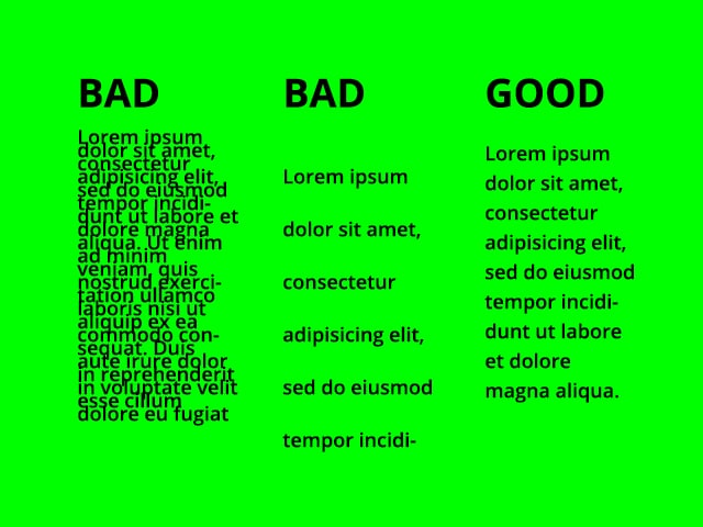
Text that's too small, lacks contrast, or uses difficult-to-read fonts forces visitors to strain their eyes. Many won't bother; they'll simply leave.
The Fix: Use a minimum of 16 pixels for body text. Ensure strong contrast between text and background. Choose readable fonts, especially for body copy. Break up long text blocks with headings, bullet points, and short paragraphs.
Nothing drives visitors away faster than unexpected audio or video blasting from their speakers. Auto-playing media is intrusive, annoying, and can be embarrassing in quiet environments.
The Fix: Let visitors choose when to play media. If you must autoplay video, do so without sound and give users clear controls to pause or mute. Respect your visitors' autonomy and environment.
When visitors are ready to reach out, they shouldn't have to hunt for your contact information. Hidden or missing contact details frustrate potential customers and erode trust.
The Fix: Make contact information easy to find, ideally in the header or footer of every page. Include multiple contact options: phone, email, contact form, and physical address if applicable. A dedicated contact page should be accessible from your main navigation.
Visitors need to trust you before they'll do business with you. Websites without testimonials, reviews, certifications, or other trust signals fail to establish credibility.
The Fix: Display customer testimonials prominently. Show logos of well-known clients or partners. Include security badges, especially on checkout pages. Feature any certifications, awards, or media mentions that build credibility.
A website that looks like it was built in 2010 signals that your business may be behind the times. Outdated design undermines credibility and makes visitors question whether your products or services are equally outdated.
The Fix: Keep your design current with modern aesthetics, layouts, and functionality. Plan for regular updates to prevent your site from looking stale. A fresh design signals an active, thriving business.
Every one of these mistakes costs you customers and revenue. The good news is that they're all fixable. By addressing these common errors, you can create a website that welcomes visitors, builds trust, and converts browsers into buyers.
Is your website driving customers away? At Extatic Design, we identify and fix the design problems that hurt your business. Contact us today for a free website audit. We'll analyze your site, identify issues, and show you how to create a website that converts. Don't let design mistakes cost you another customer. Let's fix your site!